Project overview
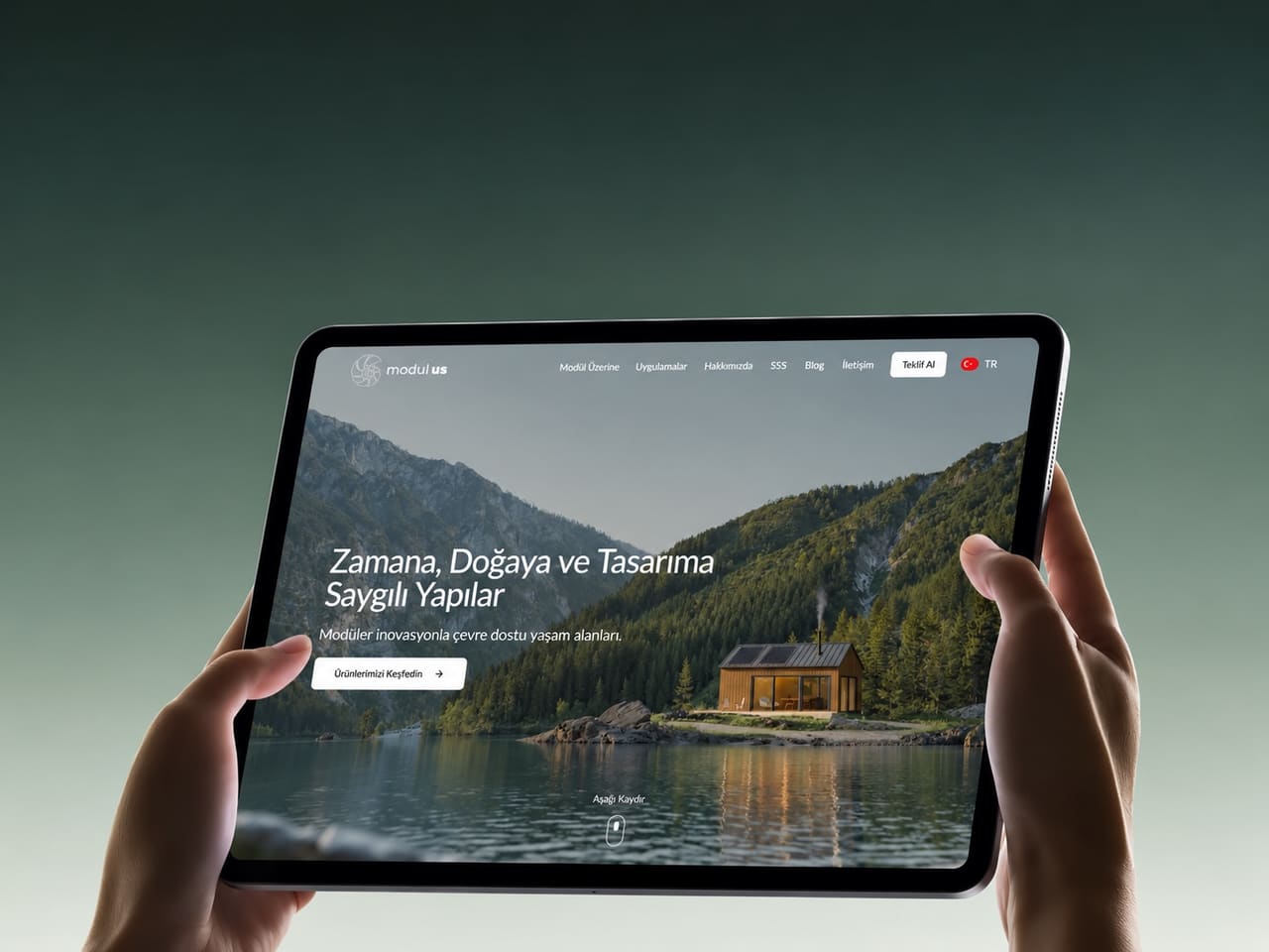
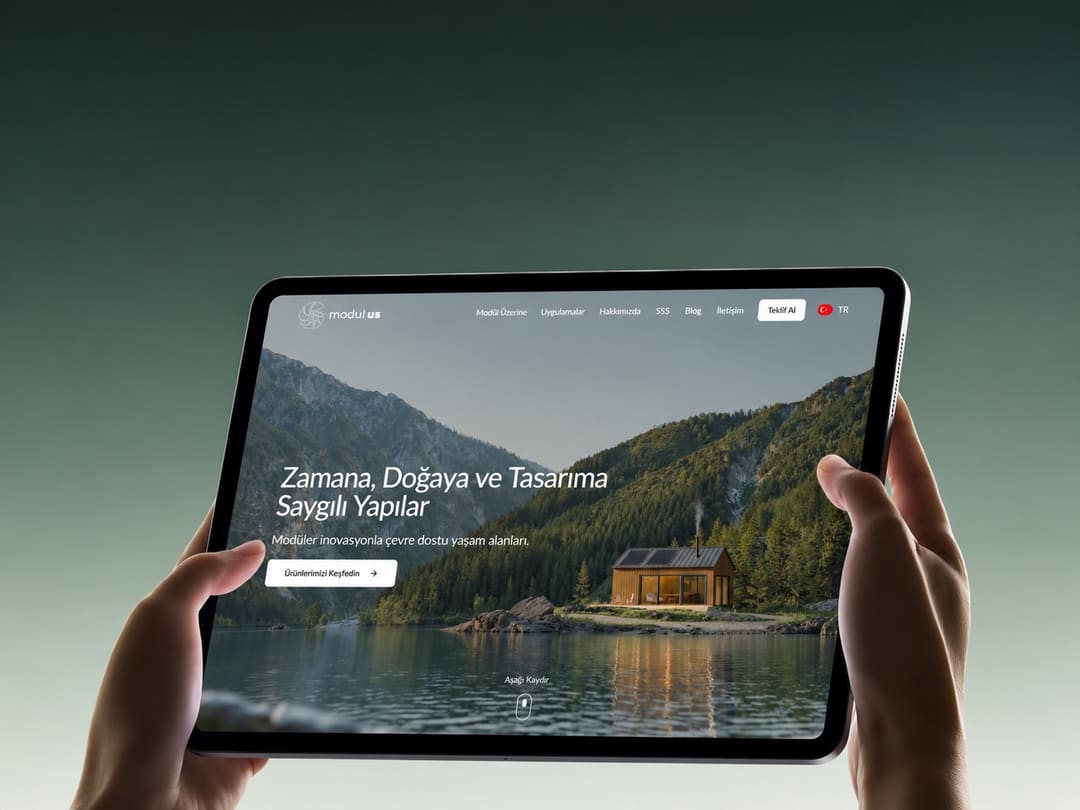
Modular buildings are an increasingly attractive option for people looking for a flexible life close to nature. Our goal for Modulus Yapı was to tell the story of that way of living, and of the company's building solutions, through an inspiring web experience.
What we built
- Products and projects: pages that showcase modular structures and completed projects with large imagery.
- Informative content: sections that explain step by step how modular construction works.
- Contact: calls to action that take interested visitors straight to an enquiry.
- Project gallery: browsing completed buildings filtered by type.
- Contact and enquiry form: a form where visitors describe their need in a few fields and reach the right team directly.
- Content management: pages, images and copy can be updated from a panel without technical knowledge.
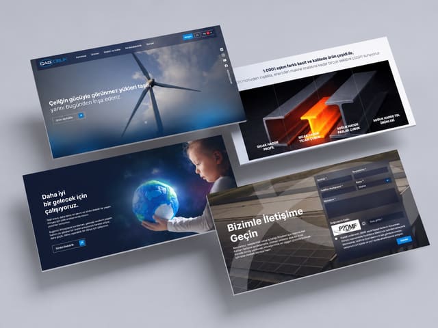
We created an airy design language drawn from the colours of nature and the clean lines of modular architecture. Image-led, spacious layouts and calm typography aim to let visitors picture themselves in those living spaces, and the site was developed to run smoothly on every device.
How we worked
For Modulus Yapı we first mapped the content structure and page hierarchy. We designed in Figma, starting from the home page and extending to every page template. We turned the approved design into code component by component, entered the content, and launched after testing across screen sizes and browsers.
Technical foundation
We built the site with React and Next.js; TypeScript keeps the code reliable and Tailwind CSS keeps the interface consistent. Content is updated from an admin panel running on Node.js and MySQL. Because pages are rendered on the server, the site loads fast and is indexed correctly by search engines.
Outcome
Modulus Yapı gained a website that tells the story of modular living in harmony with nature in a compelling way and presents its products clearly.
Technologies used
- React
- Next.js
- TypeScript
- Tailwind CSS
- Node.js
- MySQL
- Figma